Ever scrolled through endless paint color options and felt overwhelmed? Picking the perfect shade for your home can feel like a daunting task, especially when conflicting advice swirls around popular choices. Or you are just confused about choosing Sherwin Williams Accessible Beige or Sherwin Williams Agreeable Gray
Today, we’re tackling the case of Accessible Beige vs. Agreeable Gray! These two neutral shades are widely used, but are they truly “ruining homes,” They can if you choose the wrong color with them or don’t match the rest of your theme accordingly.
Instead of fear-mongering, let’s have a down-to-earth conversation about these popular colors. We’ll explore their strengths and drawbacks, how they interact with different spaces, the Best Color Combination with them ,what Bulbs to use with, and ultimately, help you decide which one might be the perfect fit for your unique style and home.
The main difference between Accessible Beige and Agreeable Gray is that Agreeable Gray is lighter,refreshing and cooler. Accessible Beige is beige, and Agreeable Gray is greige and cozy.
RELATED BLOGS:
- 9 REASONS SHOJI WHITE SHERWIN WILLIAMS PAINT COLOR IS BEST FOR SMALL SPACES
- WHAT COLORS GO WELL WITH SHERWIN WILLIAMS TRICORN BLACK?9 PAINTS APPROVED BY INTERIOR DESIGNERS
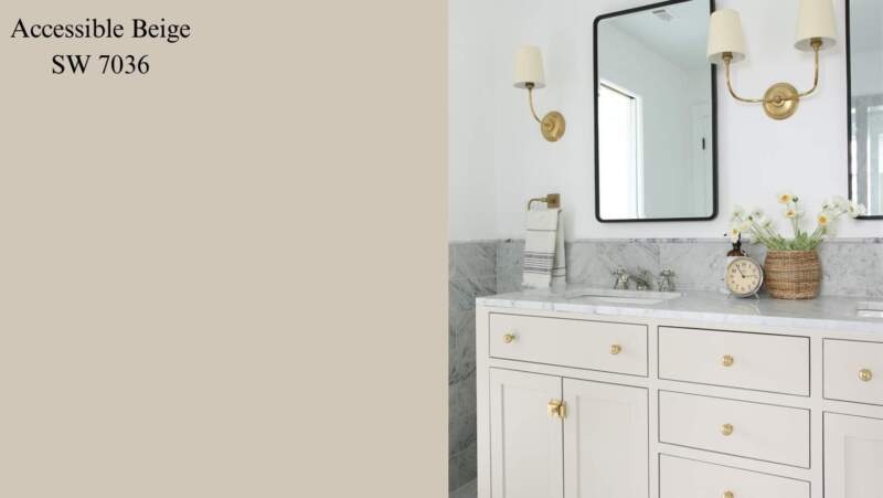
Sherwin Williams Accessible Beige
Pros
- Warm and Welcoming: Accessible Beige exudes warmth thanks to its subtle golden undertones. It’s the perfect “hug” color, ideal for creating a cozy and inviting atmosphere in living rooms, bedrooms, or home offices.
- Timeless Appeal: As a neutral beige, Accessible Beige is unlikely to go out of style quickly. It’s a safe and classic choice that can withstand changing decor trends, making it a smart investment for your home.
- Brightens Small Spaces: This warm light color can reflect light effectively, making smaller spaces feel more open and airy. It’s a fantastic option for small bedrooms, bathrooms, or hallways.
- Pairs Well with Many Colors: Accessible Beige acts as a beautiful neutral backdrop for various accent colors. Pops of vibrant blue, green, or even terracotta can add personality and contrast.
- Creates a Relaxing Atmosphere: The warmth of Accessible Beige lends itself to a relaxed and soothing atmosphere. It’s ideal for bedrooms or any space where you want to unwind.
- Hides Imperfections: With its subtle texture, Accessible Beige can help disguise minor imperfections on walls or architectural details, creating a more polished, uniform look.
- Works with Diverse Design Styles: Accessible Beige isn’t limited to traditional decor. It can easily work with modern farmhouse styles, boho spaces, or even minimalist environments if paired with the right accents.
- Evokes a Sense of Comfort: The familiarity of beige tones can create a sense of comfort and security, making it a great choice for spaces where you want to feel relaxed.
- Increases Perceived Value: Warm neutrals like Accessible Beige are popular with buyers, potentially raising your home’s value if you decide to sell in the future.
- Easy to Decorate Around: Beige’s neutrality makes it a canvas for your imagination. You can easily change your home’s personality by swapping out accent colors, decorative pillows, and artwork.
CONS
- Can Appear Bland: Although adaptable, Accessible Beige has a tendency to seem bland in certain lighting settings. Without louder accents, it could come across as uninteresting or lacking personality.
- Dated in Some Contexts: If beige is used excessively throughout a house, it may appear dated, particularly when combined with out-of-date furniture.
- Not Ideal for Cool Light: Warm natural light environments are the ideal setting for Accessible Beige. It may give a room a gloomy or chilly feeling when it faces north.
- Can Be Overwhelming: An excessive amount of beige can get boring. It works best when combined with other colors to add depth and visual intrigue.
- Doesn’t Suit All Rooms: While great for living spaces, Accessible Beige might not be the best fit for kitchens where a crisper, brighter feel is often desired.
- Hard to Get Right: Matching beige tones with other beiges and neutrals can be surprisingly difficult. Make sure you have good samples and consider undertones.
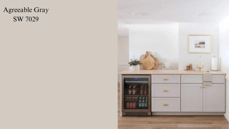
Sherwin Williams Agreeable Gray
Advantages:
- Light and Airy:Agreeable Gray efficiently reflects light, giving smaller spaces a feeling of lightness and openness. This is particularly helpful in small flats, foyers, or corridors since it gives the impression of more space.
- Modern and Versatile: This color is neutral and complements a wide range of design philosophies, including Scandinavian, modern, and minimalist. It’s like a blank canvas waiting for you to customize it with furniture and eye-catching decorations.
- Complements Diverse Decor: Compliant Gray is quite adaptable because of its faint green and blue undertones. It looks great with a broad spectrum of hues, from bright flashes of blue, green, and yellow to cozy whites and creams.
- Creates a Calming Atmosphere: The cool undertones of Agreeable Gray have a calming and soothing effect on the space. It’s ideal for bedrooms, bathrooms, or living areas where you want to create a tranquil and serene environment.
- Hides Imperfections: The slightly textured nature of Agreeable Gray can help disguise minor imperfections on walls, making your space appear more polished.
- Easy to Maintain: This light color shows dirt less readily compared to darker shades, making it a low-maintenance choice for high-traffic areas.
- Timeless Appeal: Unlike trendy colors, Agreeable Gray’s neutrality transcends fads and trends. It’s a safe and classic choice that won’t go out of style quickly.
- Raises Perceived Value: Potential customers frequently favor neutral hues like Agreeable Gray. This can potentially increase the perceived value of your home if you’re considering selling in the future.
- Boosts Natural Light: In rooms with abundant natural light, Agreeable Gray can enhance the brightness and create a light and airy feel.
- Enhances Architectural Features: The subtle shade of Agreeable Gray helps highlight architectural details like crown molding, baseboards, or built-in cabinetry, adding definition and interest to the space.
Cons:
- Can Feel Cold in Some Situations: Though soothing, Agreeable Gray’s icy undertones can occasionally make the room feel excessively sterile or cold under specific circumstances. This is particularly true in rooms with minimal natural light that face north.
- May Not Suit All Design Styles: Although adaptable, Agreeable Gray might not be the ideal choice for classic or rustic design designs. Warmer hues and textures are frequently used in these looks.
- Overuse Can Be Monotonous: If Agreeable Gray is used throughout a house without any contrasting components, the overall design may become boring and uninteresting.
- Difficult to Pair with Certain Colors: Pairing Agreeable Gray with other cool-toned colors can create a space that feels overly cool and lackluster. Adding warm accents is crucial for balancing the coolness.
- Requires Careful Lighting: The perception of Agreeable Gray can be drastically affected by lighting conditions. Using warm lighting is crucial to avoid the color appearing too blue or gray.
- Not Ideal for South-facing Rooms: In south-facing rooms with intense sunlight, Agreeable Gray can reflect the light excessively, creating a glaring and uncomfortable atmosphere.
The Best Color Combination
What colors go well with Sherwin Williams Accessible Beige (SW 7036) paint color?
1. Crisp White:
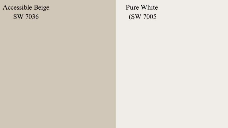
- Pure White (SW 7005): This clean white creates a bright and airy feel, ideal for trim, ceilings, and accent walls.
- Alabaster (SW 7008): A softer white option, Alabaster offers a touch of warmth while remaining light and versatile.
2. Bold Accents:
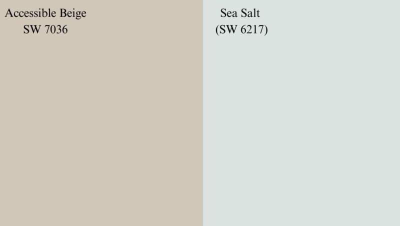
- Sea Salt (SW 6217): This calming, muted blue-green adds personality without being overwhelming.
- Black Fox (SW 9000): A dramatic black creates a statement and adds depth when used sparingly as an accent.
3. Earthy Tones:
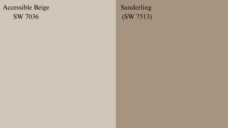
- Sanderling (SW 7513): This light, warm gray complements the beige beautifully and creates a cozy atmosphere.
- Agreeable Gray (SW 7036): Yes, even Agreeable Gray can work! Paired with Accessible Beige, it creates a sophisticated and cohesive look.
What colors go well with Sherwin Williams Agreeable Gray (SW 7036) paint color?
1. Crisp White:
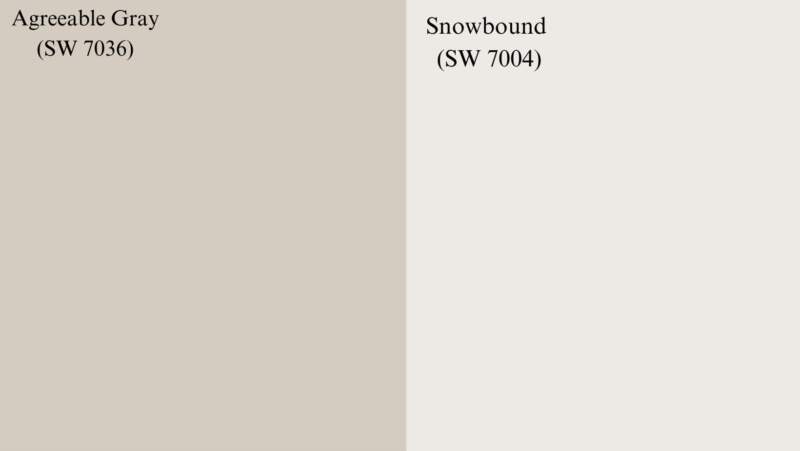
- Pure White (SW 7005): This classic white creates a clean and modern aesthetic, perfect for trim and ceilings.
- Snowbound (SW 7004): A cooler white than Pure White, Snowbound offers a crisp and contemporary feel.
2. Accent Colors:

- Hale Navy (SW 6244): This rich navy blue adds a touch of sophistication and drama, ideal for accent walls or furniture.
- Black Magic (SW 6258): Similar to Black Fox, Black Magic provides a dramatic statement but with a slightly cooler undertone.
3. Warmer Tones:
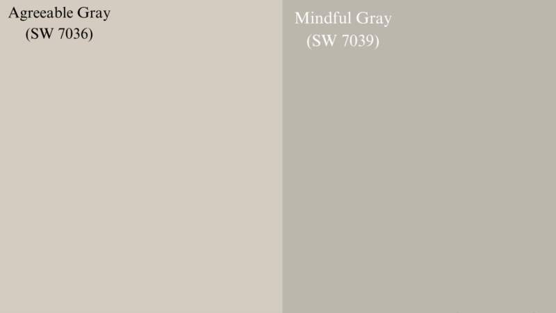
- Mindful Gray (SW 7039): This warmer gray complements Agreeable Gray nicely, creating a cozy and inviting atmosphere.
- Creamy (SW 7531): This soft cream adds a touch of warmth and richness, making it ideal for accent walls or furniture.
What light bulbs should I use with Accessible Beige and Agreeable Gray?
Picking the right light bulb can truly transform the feel of a room, and that goes for spaces painted in Agreeable Gray and Accessible Beige as well! Here’s a quick guide to choosing the ideal bulbs for each color:
Agreeable Gray:
- Warm it up: Since Agreeable Gray has cool undertones, opt for warm white or soft white bulbs. These have a color temperature around 2700K-3000K, which emit a warm and inviting glow, counteracting the coolness of the paint and creating a cozy atmosphere. Think living rooms, bedrooms, and dining areas.
- Dim the lights, set the mood: Consider dimmable bulbs. This allows you to adjust the brightness and create a more intimate feel whenever you want, perfect for relaxing evenings.
Accessible Beige:
- Embrace the warmth: Accessible Beige’s natural warmth shines best with warm white or soft white bulbs (2700K-3000K). These enhance the inviting character of the paint color. If you prefer a touch more brightness, neutral white (3000K-3500K) can also work well.
- Dimming is still your friend: Just like with Agreeable Gray, dimmable bulbs allow you to control the ambiance and create a calming atmosphere whenever you desire.
FAQs
Is Agreeable Gray still popular ?
As Agreeable Gray is soothing and refkect light give your space look bigger ,and its minimal paint color yet elegant too so its always gonna be popular because it has many mental health benefits like it calm mind and let us focus on work.
Is Accessible Beige warm or cool?
Accessible Beige is warm welcoming color you can say its cozy color that hugs you when you enter int your bedroom or home.
Does Accessible Beige have pink undertone?
Not at all,its warm brownish greshish shade of Sherwin Williams paint color that gives your home a minimal and decluttered look.
Does Accessible Beige look grey ?
Accessible Beige (SW 7036) from Sherwin-Williams is not technically a gray, but it does have warm gray undertones. This means that while the overall color appears light and beige, it has subtle hints of gray and green that can make it appear slightly gray in certain lighting conditions.In poor light conditions it can look greyish otherwise its not.
Does alabaster go with accessible beige?
Yes, Alabaster (SW 7008) from Sherwin-Williams generally pairs well with Accessible Beige (SW 7036). Both are considered light neutrals and share similar warm undertones, making them a cohesive and versatile combination for many different spaces.
What are the undertones of the Accessible Beige?
Accessible Beige (SW 7036) has warm gray undertones. This means that while the overall color appears light and beige, it has subtle hints of gray and green that can influence its appearance depending on the lighting and surrounding colors.
What color carpet goes with Agreeable Gray walls?
Agreeable Gray’s cool undertones offer flexibility when choosing a carpet. Opt for neutral colors like white, light gray, or greige for a clean and modern look. Consider a pop of color with muted navy blue or teal rugs for a touch of personality. Remember, lighting, room size, and personal preference all play a role in finding the perfect carpet match for your Agreeable Gray haven!
What color cabinets go well with Agreeable Gray walls?
For cabinets that beautifully complement Agreeable Gray walls, consider both classic neutrals and bolder choices. White and cream cabinets provide a bright, timeless look while balancing Agreeable Gray’s cool undertones. For a touch of warmth, explore natural wood tones. Alternatively, make a statement with a deep navy or a sage green cabinet – these pair surprisingly well with Agreeable Gray, offering a sophisticated and modern feel. Remember to consider the overall style of your space when making your final cabinetry decision!